Implementing sticky header with dynamic shadow
Recently, I had fun experimenting with styles by implementing a sticky header. Making a header sticky is fairly straightforward, but adding a shadow that only appears when the header becomes sticky introduces a delightful challenge. This makes the task much more interesting and non-trivial.
Creating the Boilerplate Project
For this project, I’m opting to use NextJS with pnpm, which is a fast and disk space-efficient package manager. You can read more about why one might choose pnpm over other package managers here.
To get started, create a new NextJS project by running:
pnpm create next-appAfter setting up the project, remove any unused code to keep things tidy. Next, prepare a card component that will help emulate scrollable content. This component will serve as a practical demonstration of the sticky header as you scroll. All the changes can be found in the repository.
Implementing the Header
Creating a sticky header in Tailwind CSS is quite straightforward. Let’s encapsulate this functionality within a dedicated component:
export const StickyHeader: FC<{ title: string }> = ({ title }) => (
  <h1 className="bg-slate-100 sticky top-0 w-full p-4 text-center">{title}</h1>
);
This component uses Tailwind CSS classes to make the header sticky, ensuring it stays at the top as you scroll by applying top-0.
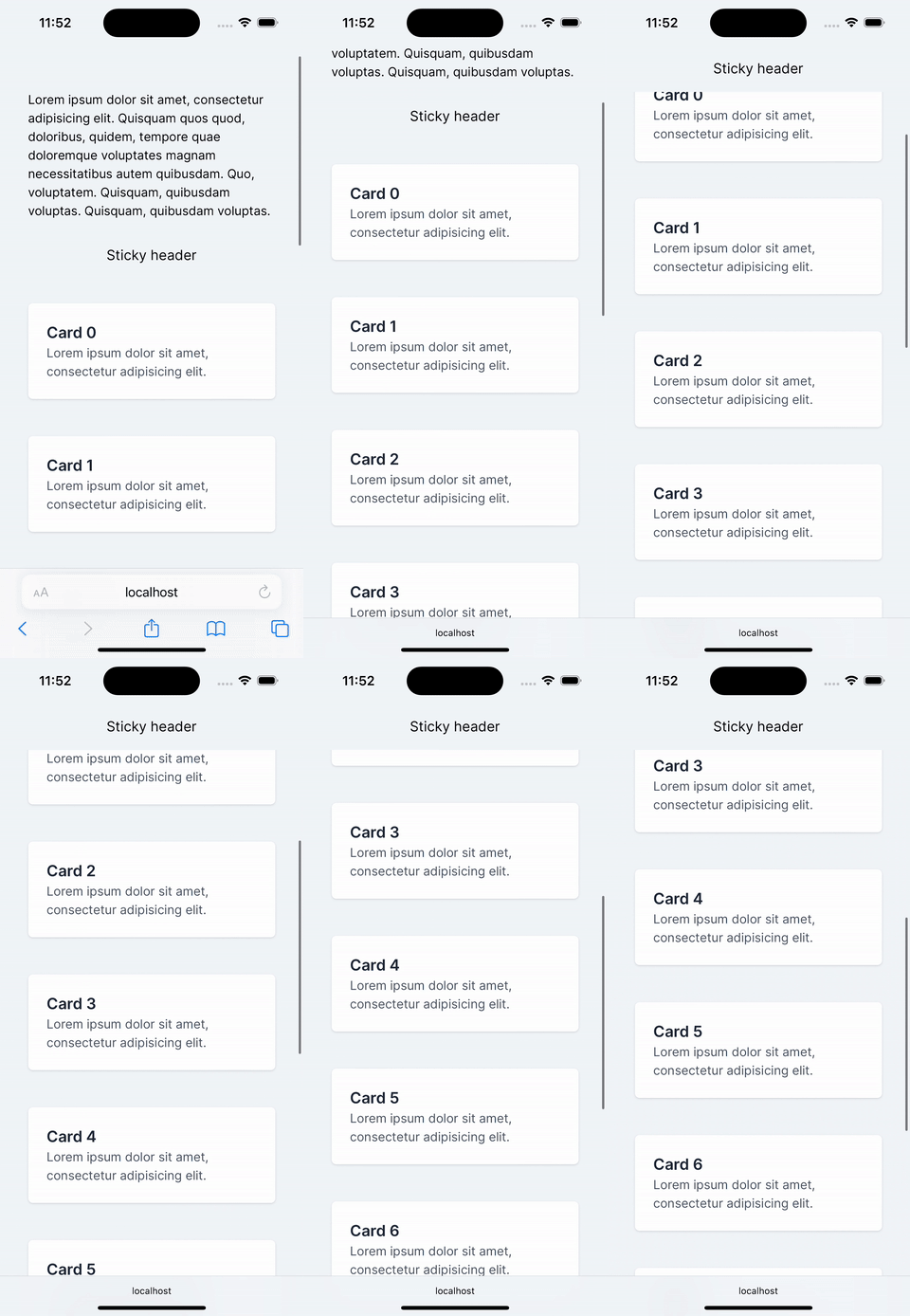 It works. However, an issue arises where cards beneath the header seem to disappear abruptly as they pass under it. To address this visual glitch, it would be beneficial to add a border or shadow at the bottom of the sticky header to delineate it from the content below once it becomes fixed to the top. This adjustment will lead us into the more complex aspects of our implementation.
There is no straightforward CSS-only way to detect when the header becomes sticky, but we can use a small hack to achieve desired behavior.
Lets start from adding the shadow.
export const StickyHeader: FC<{ title: string }> = ({ title }) => (
  <h1 className="bg-slate-100 sticky top-0 w-full p-4 text-center text-lg shadow">
    {title}
  </h1>
);
And here is the result:
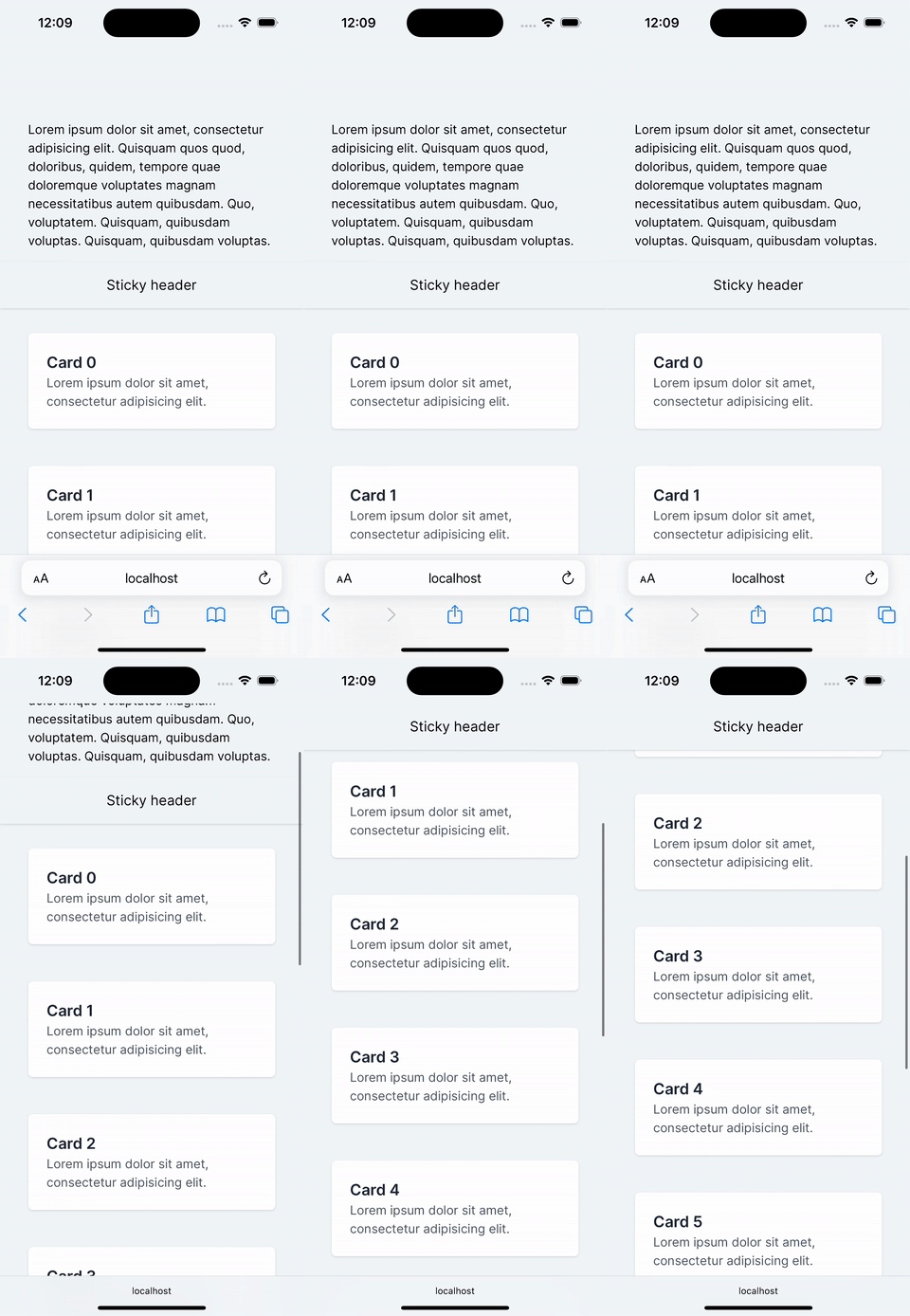
A shadow added around the entire header using Tailwind CSS’s shadow class. Initially, this seems like a solution, but it introduces new problems, as you can see in the animation above:
- The shadow appears around the entire header, not just at the bottom.
- The shadow is always visible, not only when the header is sticky.
Let’s address these issues one by one to refine our header’s behavior.
Shadow Only to the Bottom
Tailwind CSS doesn’t provide predefined classes for applying shadows to specific sides of an element. However, we can use arbitrary values within Tailwind classes, custom css classes or extend Tailwind’s theme to include custom styles. For production environments, extending the theme is often preferred. This approach takes advantage of Tailwind’s Just-in-Time (JIT) compiler, which generates CSS only for the classes used, optimizing performance and keeps them reusable unlike usage arbitrary values.
Here’s how you can extend the theme to include a custom class shadow-b for bottom-only shadows:
const config: Config = {
	...
	theme: {
		...
		boxShadow: {
			...
			b: "0 5px 8px -1px rgba(0, 0, 0, 0.1)",
			...
		},
	},
	...
};
Apply this new shadow style to our header (Shadow changed from shadow to shadow-b):
export const StickyHeader: FC<{ title: string }> = ({ title }) => (
  <h1 className="bg-slate-100 shadow-b sticky top-0 w-full p-4 text-center text-lg">
    {title}
  </h1>
);
Checking the result:
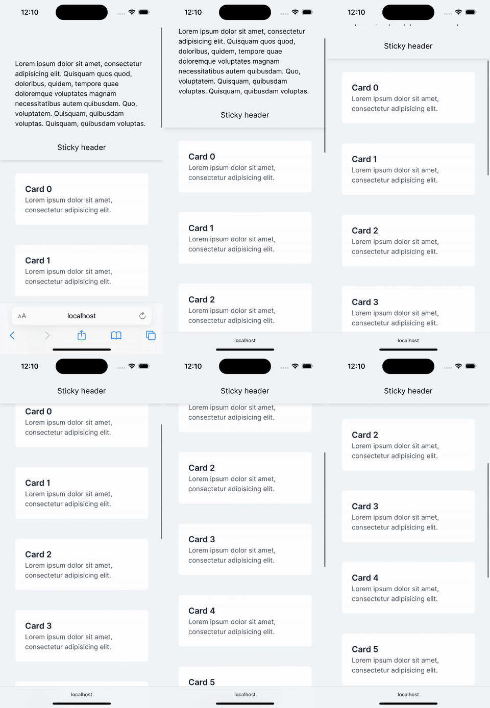
After applying the custom shadow, the visual results show the shadow only at the bottom of the header, aligning more closely with our design goals. However, the shadow is still visible from the start, not just when the header is sticky. Our next step is to tackle this issue, ensuring the shadow appears only when needed.
Hide the Shadow and Display When Sticks
To control the visibility of the shadow only when the header is sticky, we can employ a clever CSS trick: overlaying an invisible element with a higher z-index right above the shadow. This method effectively hides the shadow under normal circumstances and only reveals it when the header sticks to the top.
Here’s how we implement it:
export const StickyHeader: FC<{ title: string }> = ({ title }) => (
  <>
    <h1 className="bg-slate-100 shadow-b sticky top-0 w-full p-4 text-center text-lg">
      {title}
    </h1>
    <div className="bg-slate-100 z-10 -mt-4 h-2 w-full" />
  </>
);
The div is placed to overlap the shadow using negative margin (-mt-4). This setup ensures that the shadow is invisible until the header becomes sticky.
After implementing this method, the shadow behaves as intended.
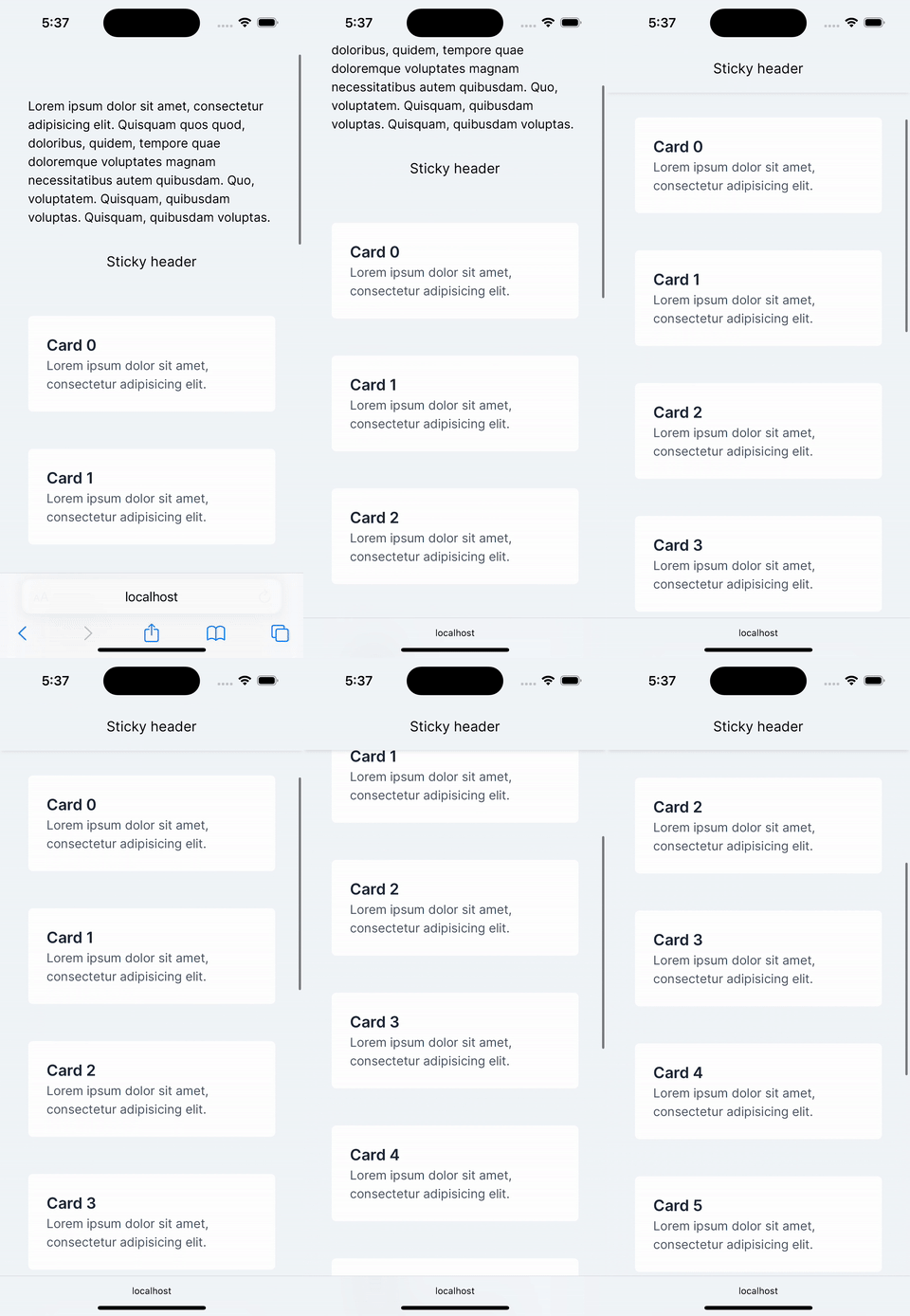 However, a nasty visual artifact arises: the element used to hide the shadow partially overlaps the header’s text during scrolling when the header is sticky, as shown in the animation.
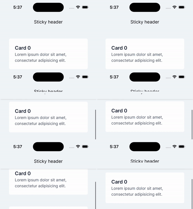 To address this new challenge, we need to refine our approach so that the text remains unobstructed while maintaining the shadow effect.
Fixing UI bug
To resolve the overlapping issue, we adjusted the structure and z-index of our elements. By separating the shadow from the header and setting proper z-index values, we can keep the shadow visible only when needed, without overlapping element interfering with the header text.
Here’s the updated component:
export const StickyHeader: FC<{ title: string }> = ({ title }) => (
  <>
    <h1 className="bg-slate-100 sticky top-0 -mb-4 w-full p-4 text-center text-lg">
      {title}
    </h1>
    <div className="shadow-b sticky top-[52px] h-2 w-full" />
    <div className="bg-slate-100 z-10 -mt-4 h-2 w-full" />
  </>
);
In this setup:
- The
-mb-4margin adjustment on the header compensates for the space taken by additional elements. - The shadow is now on a separate
divthat is positioned just below the header. Thesticky top-[52px]positioning ensures it remains in place as you scroll. - A third
div, also is not sticky but with higher z-index than shadow, so it covers the shadow when the header is not at the top, preventing it from showing prematurely.
With these changes, the shadow now appears correctly only when the header sticks to the top, and no part of the header text is obscured during scrolling. Here’s how it looks in action:
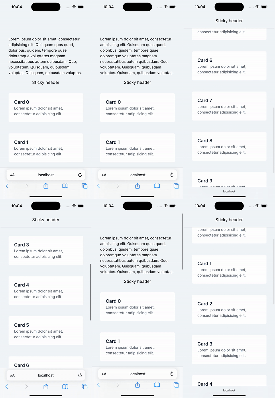 This final adjustment effectively resolves the visual glitch and achieves the desired effect with a clean, functional UI.
Summary
In this tutorial, we detailed how to implement a sticky header with a dynamic shadow using Tailwind CSS. The solution ensures a seamless shadow appearance as the header transitions to a fixed position. It worked for me for both web and hybrid applications. Though I will be happy to know about other approaches.